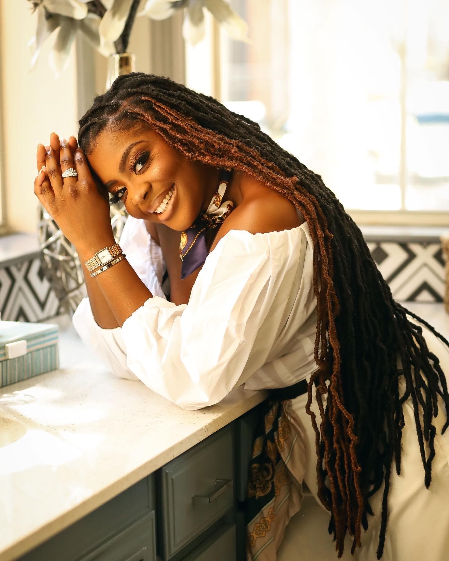
There is always that one photograph from a wedding where half the guests look radiant and the other half seem to have disappeared into the fabric. Same colour. Same ceremony. Entirely different results.
That is not a coincidence — and it is not about who is more photogenic. It is almost always a colour and tone decision that was made before anyone got dressed.
If you are coordinating asoebi for an upcoming event, or you have been chosen to help select the colour, this matters more than most people realise. The right shade does not just look stunning in person. It works across a range of skin tones, holds up under event lighting, and translates with clarity in photographs — whether those photographs are taken by a professional or on someone's phone at the reception table.
Why Asoebi Colour Selection Is a Craft, Not a Preference
Most colour decisions happen based on what the couple loves, what is trending on Instagram, or what fabric vendors have in stock. All of that is understandable. But those starting points do not account for the full picture — which is that asoebi is worn by a group of people, and that group will span a range of complexions, undertones, and body types.
A colour that photographs like a dream on deep mahogany skin can appear washed out or grey on a lighter complexion. A pale blush that looks effortlessly soft on a medium brown skin tone can become flat and difficult to distinguish in bright outdoor light. The goal is to select a colour that has enough depth and warmth to serve everyone — not just the person who went shopping.
I always advise starting with the undertone rather than the hue. Warm undertones — the golds, the ambers, the burnt siennas — tend to be the most forgiving across the spectrum. They add warmth where needed and deepen beautifully against darker complexions. Cool tones can work, but they require more precision. A cool lilac, for example, can look extraordinary — but only if it carries enough saturation to hold its ground under artificial lighting.
The Colours That Consistently Work — and Why
Certain shades have proven themselves at event after event, across skin tone ranges and photography conditions.
Rich burnt orange is one of them. It is a colour that appears to wake up against deep brown skin, while still offering warmth and dimension for lighter complexions. Under both natural and artificial light, it retains its character. Photographs well, almost without exception.
Dusty rose — not the pale, washed-out version, but the one with a bit of terracotta running through it — is another. It sits in that rare space between warm and soft, which means it flatters without overwhelming. On camera, it tends to read as romantic rather than bland, which matters when you are looking at images two years later.
Deep forest green carries weight and intention. It does not compete with any skin tone — it frames. Against deeper complexions, it creates a contrast that is striking and elegant. Against lighter skin tones, it grounds the look rather than washing it out. It also holds extraordinarily well under flash photography, which is where so many colours lose themselves.
Chocolate brown, often overlooked, is one of the most quietly powerful asoebi choices available. It reads as richness. It layers beautifully with gold accessories, it does not tire across different lighting conditions, and it photographs with a consistency that more vibrant colours sometimes cannot sustain.
What to Avoid — and What to Tell Your Guests
There are colours I approach with caution when coordinating group looks. Very light pastels — mint, baby blue, pale lemon — often struggle under the conditions of a Nigerian celebration. The lighting tends to be warm and intense, the movement is constant, and pastel shades can disappear into themselves. They require a specific combination of fabric texture and photography expertise to land well, and that is a risk in a coordination context.
Neon shades have a similar challenge. They can look electric and celebratory in person, but cameras — particularly phone cameras — often struggle to render them accurately. The colour either bleeds, overexposes, or shifts entirely. What looked incredible at the venue can look entirely different on screen.
When I work with families and bridal parties on asoebi coordination, I also encourage them to communicate with guests about accessories and makeup. The colour of the fabric is only one layer of the image. A guest who pairs a warm burnt orange fabric with cool-toned silver and nude makeup is working against herself. Small, practical guidance — warm gold jewellery, a lip colour with depth, a headpiece that complements rather than competes — makes the difference between a good event photograph and a genuinely beautiful one.
The colour you choose sets the tone. But it is the intention behind the choice — the awareness of who will be wearing it, where they will be standing, and how light will fall on them — that makes an asoebi moment truly cohesive.
If you are coordinating an upcoming event or looking for support with your guest look, explore GLO Styles.