What the Camera Does That Your Eyes Don't
Cameras, especially in lower light or under harsh flash, do two things consistently: they flatten depth and they amplify contrast. A colour that feels rich and dimensional in person can read as flat or faded once it is captured. Conversely, very pale or highly saturated tones can blow out entirely — losing their nuance under bright event lighting or direct sun.
This is why the tonal weight of a colour matters as much as the colour itself. Tonal weight refers to how light or dark a shade reads, not simply what colour family it belongs to. A dusty rose and a coral may both be "pink," but one carries significantly more weight and will photograph with far more presence. When you are choosing Asoebi fabric, you want a colour that holds its character — one that the camera can grip.
Jewel tones do this exceptionally well. Deep emerald, rich cobalt, wine, and royal purple all carry enough tonal weight to remain vivid in photographs without distorting. Earthy tones — terracotta, burnt sienna, warm bronze — are similarly reliable. They are not trying to compete with the light. They simply hold their own within it.
Flattering Every Woman in the Room
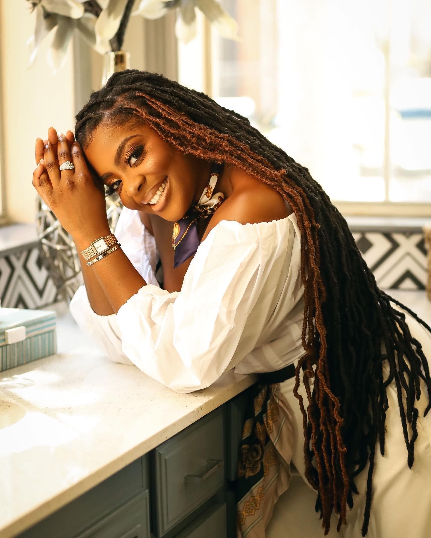
Here is where the real art lies. A colour that looks exceptional on one woman may do very little for another, and when your Asoebi group includes the full spectrum of melanin — which it almost always does — you need a shade that is generous enough to honour everyone.
Colours with warm or neutral undertones tend to be the most inclusive. A warm champagne gold, for instance, will illuminate deep skin tones and add warmth to lighter ones. A rich olive green, which can look muted in isolation, becomes extraordinary on deeper complexions and remains elegant on medium to lighter tones. The mistake most people make is choosing a colour they personally look good in without stress-testing it across the range of their tribe.
Cool, icy tones — pale lavender, baby blue, mint — are the most difficult to coordinate across varied skin tones. They tend to flatter a narrower range of complexions and rarely photograph with the same vibrancy they have in person. This does not mean they are wrong — it means they require more deliberate fabric texture and styling to carry weight in photographs. A heavily embroidered icy tone, for example, creates enough visual interest that the camera has something to hold onto even when the colour alone might struggle.
Avoid colours that are too close to the skin in tone — not because they cannot be beautiful, but because in a group photograph, definition matters. You want each woman to be seen as a distinct, luminous presence within the collective, not absorbed into it.
Fabric and Finish Matter More Than You Think
The colour is only half of it. A matte fabric in a rich shade will photograph entirely differently from a heavily embellished or shiny version of the same colour. Sequin and metallic fabrics create their own light — they become active participants in the photograph rather than passive backgrounds to accessories.
If your Asoebi colour is on the more muted or medium end of the spectrum, the fabric finish can rescue it. A velvet deep burgundy will always read with more weight than a satin version of the same shade. An aso-oke with gold threading will remain luminous even if the base colour is conservative. Think about what the camera will catch, not just what the eye sees standing still in a boutique.
When you approach Asoebi coordination this way — thinking in terms of tonal weight, undertone generosity, and fabric finish together — the choices become clearer. Less about what is trending, more about what will serve every woman wearing it, in every lighting condition, long after the music stops.
If you're coordinating an upcoming event or looking for support with your guest look, explore GLO Styles — where the details that seem small are given exactly the attention they deserve.